Table of Contents
Choosing the perfect font for your wedding invitations is an essential part of the wedding planning process. The right font can set the tone for your entire event, reflecting your personal style and the theme of your wedding. With so many options available, it can be overwhelming to decide which fonts to use. Here are some tips to help you choose the perfect wedding invitation fonts.
1. Consider Your Wedding Theme
Before diving into font selection, take a moment to think about your wedding theme. Is it rustic, modern, vintage, or elegant? The font you choose should complement the overall aesthetic of your wedding. For example, a whimsical script font may work beautifully for a garden wedding, while a clean sans-serif font might be more appropriate for a contemporary celebration.
2. Match the Tone
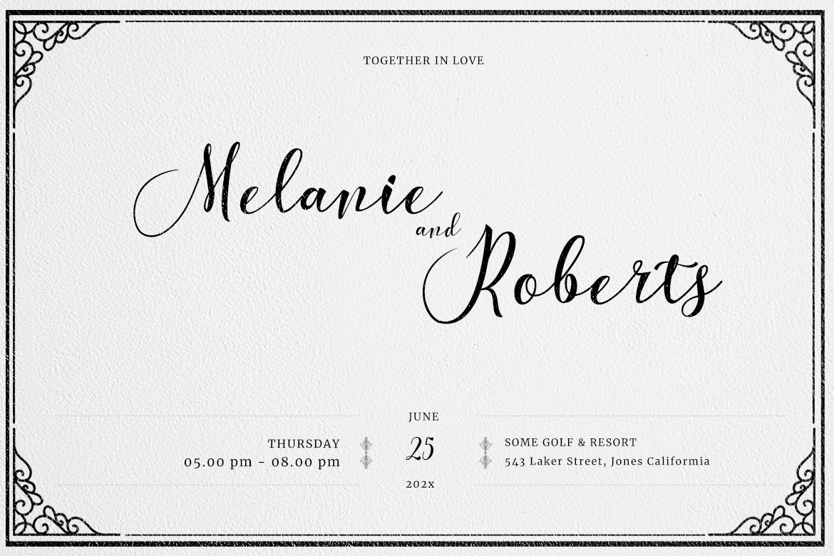
The tone of your wedding invitation should align with the formality of your event. If you’re planning a formal affair, consider using classic serif fonts like Times New Roman or Garamond. For a more casual wedding, playful fonts like Comic Sans or handwritten styles can add a fun touch. Remember, the font should convey the mood you want your guests to feel when they receive your invitation.
3. Readability is Key
While it’s tempting to choose a font that looks beautiful, readability should always be a priority. Your guests should be able to easily read the details of your invitation without straining their eyes. Avoid overly intricate fonts that may be difficult to decipher, especially for important information like the date, time, and location.
4. Limit Your Font Choices
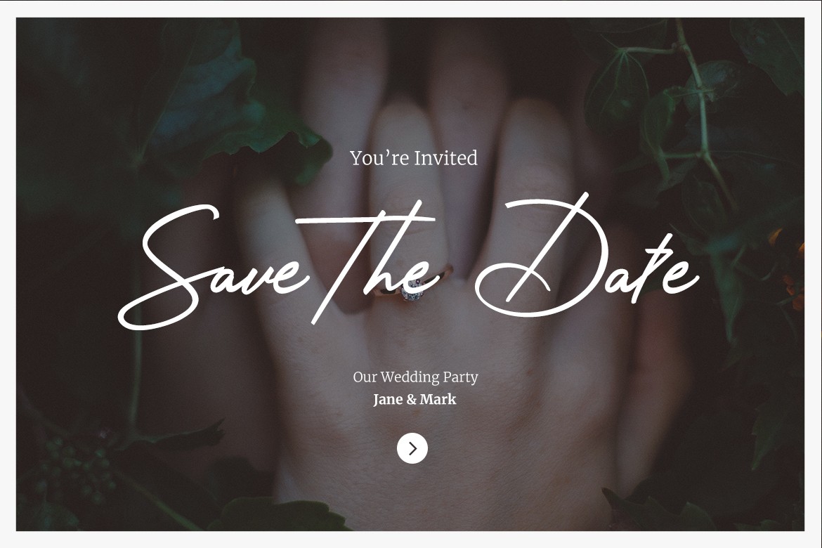
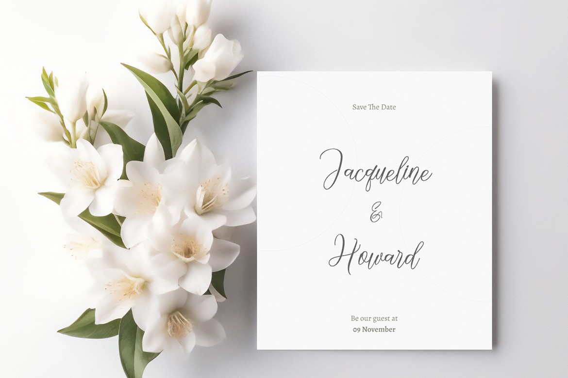
Using too many different fonts can make your invitation look cluttered and chaotic. A good rule of thumb is to stick to two or three complementary fonts. For example, you might choose a decorative script font for your names and a simple sans-serif font for the rest of the text. This creates a harmonious balance and keeps the focus on the essential details.
5. Pay Attention to Size and Spacing
Font size and spacing can significantly impact the overall look of your invitation. Make sure that the font size is large enough to be easily read, especially for the main details. Additionally, pay attention to line spacing and letter spacing to ensure that the text is well-organized and visually appealing. A little extra space can make a big difference in readability.
6. Test Different Combinations
Don’t be afraid to experiment with different font combinations. Create a few mock-ups of your invitation using various fonts to see how they look together. This will help you visualize the final product and make it easier to choose the best options. You can also seek feedback from friends or family to get a fresh perspective.
7. Consider Your Personal Style
Ultimately, your wedding invitation should reflect your personal style as a couple. Think about the fonts you love and how they represent your relationship. Whether you prefer classic elegance or modern minimalism, choose fonts that resonate with you and feel authentic to your love story.
8. Don’t Forget About the Envelope
The font you choose for your invitation doesn’t have to stop at the card itself. Consider the font for your envelope as well. The envelope is the first thing your guests will see, so make sure it aligns with the overall design of your invitation. A cohesive look will create a polished and professional appearance.
Have you read : What is Handwritten Font ?
Our Best Font for Wedding Invitation
Oakenscript Classic Font Script
Sweety Dust Handwritten Script Font
Conclusion
Choosing the right fonts for your wedding invitations is an important step in the planning process. By considering your wedding theme, matching the tone, prioritizing readability, and limiting your font choices, you can create beautiful invitations that reflect your unique style. Remember to test different combinations and don’t hesitate to seek feedback. With these tips in mind, you’ll be well on your way to selecting the perfect fonts for your special day. Happy planning!

