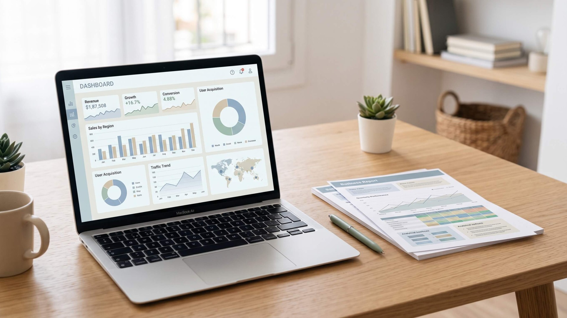
Businesses rely on data to monitor performance, identify trends, and make informed decisions. Two common tools for presenting business data are dashboards and reports. Although they often contain similar information, they serve different purposes.
A dashboard provides a quick, visual overview of key performance indicators (KPIs) and business metrics, while a report offers more detailed information, context, and analysis over a specific period.
Understanding the difference between a dashboard and a report can help businesses choose the right format for tracking performance, communicating results, and supporting decision-making.
What Is a Dashboard?
A dashboard is a visual interface that displays important business metrics and performance indicators in one place. It is designed to help users monitor business performance quickly without having to review large amounts of data.
Most dashboards use visual elements such as charts, graphs, scorecards, and progress indicators to make complex information easier to understand.
For example, a marketing dashboard might display website traffic, conversion rates, advertising spend, and campaign performance. A sales dashboard could show monthly revenue, sales targets, lead generation, and conversion rates.
Key Characteristics of a Dashboard
- Visual presentation: Uses charts, graphs, and KPI cards to make data easier to interpret.
- Real-time or frequently updated data: May display live information or refresh data at scheduled intervals, depending on the system.
- Quick performance monitoring: Highlights important metrics so users can identify changes and potential issues.
- Interactive elements: May include filters, date ranges, and drill-down features to explore specific data.
- Continuous access: Typically designed for ongoing monitoring rather than one-time review.
Dashboards are particularly useful for teams that need to monitor performance regularly and respond quickly to changes.
What Is a Business Report?
A business report is a structured document that presents data, findings, analysis, and sometimes recommendations related to a particular business activity or objective.
Unlike dashboards, which focus on quick visual summaries, reports provide more context about what happened, why it happened, and what the results might mean.
For example, a monthly marketing report might include campaign performance, advertising expenditure, audience engagement, conversion rates, and an explanation of the factors that influenced the results.
Key Characteristics of a Business Report
- Detailed information: Includes data, explanations, and supporting evidence.
- Defined reporting period: Usually covers a specific timeframe, such as a week, month, quarter, or year.
- Context and analysis: Explains performance trends, significant changes, and possible contributing factors.
- Structured format: Often includes an executive summary, key findings, charts, tables, and conclusions.
- Communication-focused: Designed to share results with stakeholders, clients, managers, or decision-makers.
Business reports are useful when teams need to explain performance, document progress, communicate findings, or support strategic decisions.
Dashboard vs Report: Key Differences
Although dashboards and reports can display similar business metrics, their primary purposes and presentation styles are different.
| Criteria | Dashboard | Report |
|---|---|---|
| Primary purpose | Monitor business performance | Analyze and communicate business results |
| Data presentation | Visual summaries, charts, and KPI cards | Charts, tables, text, and detailed explanations |
| Data updates | Real-time or scheduled updates | Usually generated for a specific reporting period |
| Level of detail | High-level overview | Detailed analysis and context |
| Interactivity | Often interactive, with filters and drill-downs | Usually static, although interactive reports are possible |
| Typical audience | Managers, analysts, and operational teams | Executives, clients, stakeholders, and project teams |
| Frequency | Used continuously or regularly | Created periodically or when needed |
| Main question | What is happening now? | What happened, why, and what does it mean? |
| Common format | Web interface or analytics platform | PDF, presentation, spreadsheet, or document |
The main distinction is that dashboards help users monitor ongoing performance, while reports help them understand and communicate results in greater detail.
When Should You Use a Dashboard?
A dashboard is useful when you need to monitor important metrics frequently and identify performance changes without reviewing a lengthy document.
Consider using a dashboard in the following situations:
1. Monitoring Daily Business Performance
Businesses that track daily operations can use dashboards to monitor sales, website traffic, customer activity, or operational efficiency. A centralized view helps teams identify changes and investigate potential problems.
2. Tracking KPIs and Business Goals
Dashboards make it easier to compare actual performance against targets. For example, a sales team can monitor monthly revenue, the number of qualified leads, and progress toward sales goals.
3. Managing Marketing Campaigns
Marketing teams can use analytics dashboards to monitor campaign performance across different channels. Metrics such as impressions, clicks, engagement, and conversions can help teams identify which campaigns require further attention.
4. Making Operational Decisions
When managers need to make frequent operational decisions, dashboards provide a convenient way to review key metrics. They can use the information to investigate performance changes and determine whether further action is necessary.
When Should You Use a Business Report?
Reports are more suitable when you need to explain performance, provide detailed analysis, or communicate findings to other people.
1. Preparing Monthly or Quarterly Performance Reviews
Business reports help summarize performance over a defined period. They can include comparisons with previous periods, explanations of significant changes, and progress toward business objectives.
2. Presenting Results to Clients
Agencies and consultants often use reports to communicate campaign results, project progress, and business outcomes to clients. A well-structured report helps clients understand the work performed and the results achieved.
3. Explaining Trends and Performance Changes
A dashboard may show that website traffic has declined, but a report can provide more context by comparing traffic sources, examining historical trends, and discussing possible reasons for the decline.
4. Supporting Strategic Planning
Business reports can combine historical data, performance analysis, and recommendations to support planning. They help decision-makers understand previous results before establishing future objectives.
Dashboard vs Report: A Practical Example
Consider a marketing team responsible for managing a company's digital marketing activities.
The team uses a marketing dashboard to monitor website traffic, advertising spend, conversion rates, and social media engagement throughout the month.
At the end of the month, the team prepares a marketing performance report using the same data. The report includes a summary of campaign results, comparisons with the previous month, an analysis of successful campaigns, and areas that need improvement.
| Marketing Metric | Dashboard | Monthly Report |
|---|---|---|
| Website traffic | Displays current traffic and trends | Compares traffic with previous months |
| Conversion rate | Shows the current conversion rate | Analyzes conversion changes and possible causes |
| Advertising spend | Tracks spending against budget | Evaluates spending efficiency and campaign results |
| Social media engagement | Displays engagement metrics | Explains engagement trends and campaign performance |
| Campaign performance | Highlights key campaign metrics | Provides detailed comparisons and findings |
In this example, the dashboard supports ongoing campaign monitoring, while the report provides a more complete explanation of the month's results.
Can You Use a Dashboard and a Report Together?
Yes. Dashboards and reports are complementary tools, and using both can create a more complete business performance monitoring process.
A dashboard helps teams identify important changes as they happen or as new data becomes available. A report then provides an opportunity to review those changes, investigate their causes, and communicate findings to stakeholders.
For example, a company might use the following workflow:
- Monitor: Use a dashboard to track business KPIs and identify performance changes.
- Investigate: Review the data to understand significant changes or unexpected results.
- Analyze: Prepare a report with detailed metrics, comparisons, and explanations.
- Communicate: Share the report with stakeholders and discuss potential next steps.
- Improve: Use the findings to adjust business activities and continue monitoring performance.
This approach allows businesses to combine frequent performance monitoring with structured analysis and communication.
How to Choose Between a Dashboard and a Report
The right format depends on your objectives, audience, and how frequently the information needs to be reviewed.
- Choose a dashboard if you need to monitor KPIs regularly, view current performance, or investigate changes in business metrics.
- Choose a report if you need to explain results, provide detailed analysis, document progress, or present findings to stakeholders.
- Use both if your business needs continuous performance monitoring as well as detailed reporting and communication.
Consider who will use the information and what they need to do with it. Operational teams may benefit from dashboards, while executives and clients may need structured reports that explain the results.
Creating Effective Business Reports
Regardless of whether you use dashboards, reports, or both, the information should be easy to understand and relevant to the audience.
When creating a business report, consider the following practices:
- Define your objective: Identify the questions the report needs to answer before selecting metrics.
- Focus on relevant KPIs: Include metrics that directly support the report's purpose rather than overwhelming readers with unnecessary data.
- Provide context: Compare results with previous periods, targets, or relevant benchmarks where appropriate.
- Use clear visualizations: Choose charts and tables that make comparisons and trends easy to understand.
- Explain the findings: Include concise explanations of important results instead of presenting numbers without context.
- Keep the layout consistent: Use clear headings, consistent formatting, and a logical structure to help readers navigate the report.
A well-designed business report should make it easy for readers to understand the key findings without having to interpret every data point themselves.
If you need a ready-made layout for presenting business information, explore our business presentation templates. They can help you organize key findings, charts, and performance insights into a clear presentation.
Conclusion
The difference between a dashboard and a report comes down to their purpose. A dashboard provides a visual overview for monitoring business performance, while a report delivers more detailed information and analysis for understanding and communicating results.
Dashboards are useful for ongoing monitoring, whereas reports are valuable for periodic reviews, stakeholder communication, and strategic planning. For many businesses, using both together provides a practical way to track performance and turn data into meaningful business insights.