
UI Design Strategy for Vibe Coders: A Practical Guide to Building Better Interfaces with AI
Learn how to build better AI-generated interfaces with a practical UI design strategy. Explore design systems, prompting techniques, visual references, and iterative workflows for creating consistent, professional, and user-friendly applications.
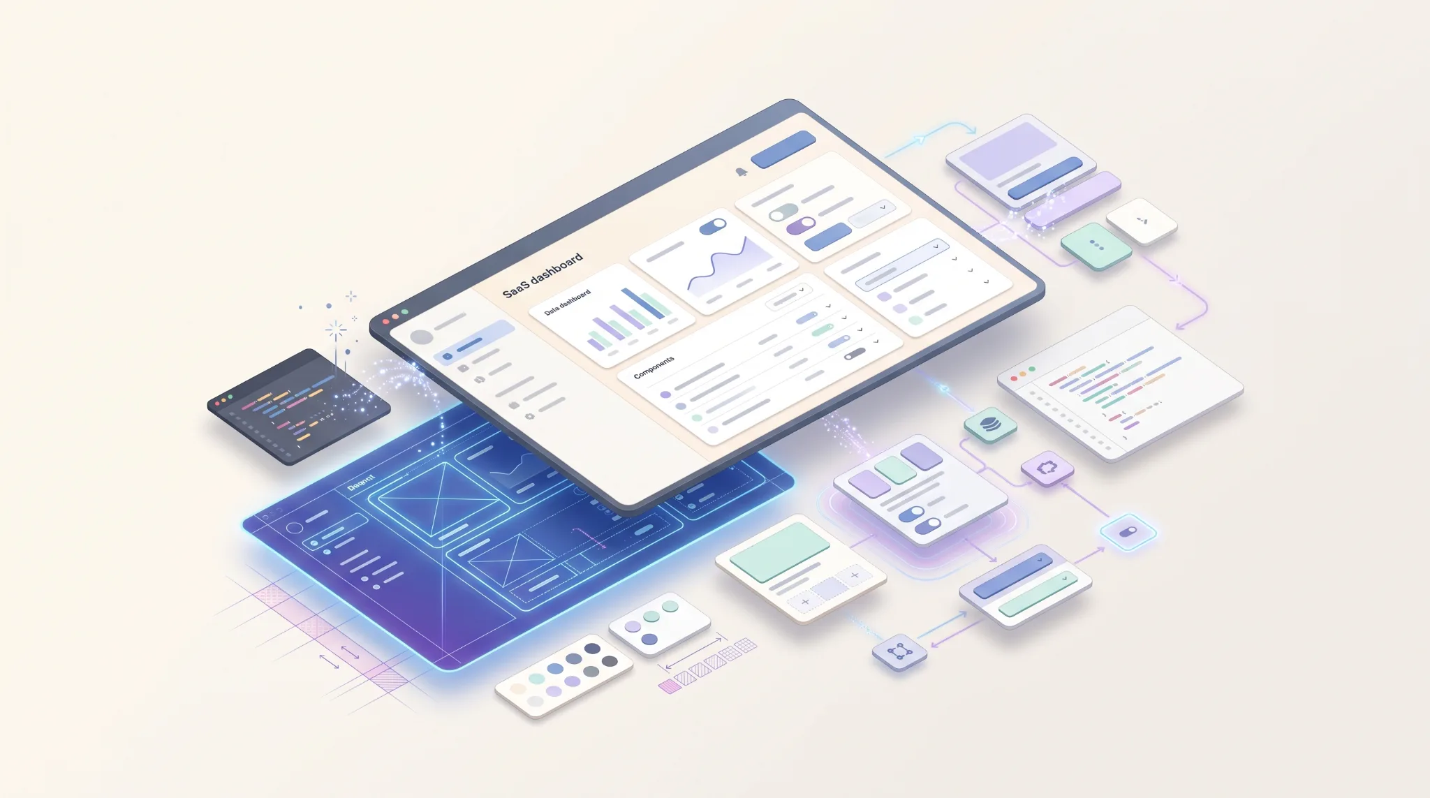
Vibe coding has changed how developers build digital products. With AI-powered coding assistants, you can turn a product idea into a working application without manually writing every component, styling rule, or line of boilerplate code.
But there is a catch: getting an interface to work is not the same as making it good.
AI can generate a dashboard with charts, a landing page with polished cards, or a SaaS interface with a sidebar and navigation. Yet the result may still feel generic, inconsistent, difficult to navigate, or disconnected from the needs of its users.
The problem is not necessarily the AI model or the coding tool. Often, it is the absence of a clear UI design strategy.
A better approach is to treat design as a structured process rather than a single prompt. By defining the product, establishing visual direction, creating reusable design rules, and evaluating the output iteratively, vibe coders can build interfaces that are not only functional but also coherent, usable, and maintainable.
This guide explains how to create that workflow, from the first product idea to the final UI review.
1. Define Your Product Before Writing UI Prompts#
One of the most common mistakes in vibe coding is jumping directly from an idea to a prompt.
For example, asking an AI assistant to "build a modern project management dashboard" provides very little context. The model must make assumptions about the users, information hierarchy, features, layout, and visual style.
The result may look reasonable, but it will probably resemble dozens of other dashboards.
Before writing your first UI prompt, answer three questions:
- Who is the interface for? Identify the primary users and their technical familiarity.
- What should users accomplish? Define the most important tasks they need to complete.
- What information matters most? Prioritize the data, actions, and decisions that belong on each screen.
Consider a fleet management application. Its primary users might need to monitor active vehicles, identify delayed deliveries, review driver activity, and respond to operational alerts.
Those requirements should influence the interface. A fleet dashboard needs clear status indicators, location information, operational summaries, and quick access to exceptions. A generic collection of charts and statistic cards is not enough.
Start by defining the product's core user journeys and translating them into screen requirements. Even a short outline can significantly improve the quality of AI-generated UI.
2. Create a UI Design Strategy Before Prompting#
Once you understand the product, establish its visual direction.
A UI design strategy defines how the interface should look, feel, and behave. It connects product requirements with visual decisions and interaction patterns.
Your strategy should cover:
- Visual personality: Professional, playful, editorial, technical, minimal, or another deliberate direction.
- Layout principles: Navigation structure, content width, grid system, and information density.
- Typography: Font families, heading hierarchy, body text, and readable line lengths.
- Color system: Primary actions, neutral surfaces, borders, text, and semantic colors.
- Interaction patterns: How menus, forms, dialogs, filters, and notifications behave.
Visual direction should reflect the product and its audience rather than whichever style is trending.
For example, a financial analytics platform may benefit from restrained colors, precise typography, and dense but organized information. A creative collaboration tool might use more expressive visuals and a lighter content structure.
You can also collect two or three reference interfaces that demonstrate useful design patterns. The objective is not to reproduce them exactly, but to understand why their layouts, hierarchy, and interactions work.
Turn these decisions into a short design brief before asking AI to implement the interface.
3. Build a Design System Before Building Every Screen#
A design system provides the rules that keep an interface consistent as it grows.
Without shared rules, AI-generated pages can gradually develop different spacing values, inconsistent button styles, competing colors, and slightly different versions of the same component.
A lightweight design system helps prevent these problems.
Start with design tokens#
Define reusable values for:
- Colors and semantic states
- Typography sizes, weights, and line heights
- Spacing and layout dimensions
- Border radii and borders
- Shadows and elevation
- Responsive breakpoints
These values should be expressed through CSS custom properties, theme configuration, or the equivalent mechanism in your chosen stack.
Create reusable components#
Next, establish the core components your application needs. These commonly include buttons, inputs, selects, cards, tables, badges, modals, alerts, and navigation elements.
Document their variants and states. A button, for example, may have primary, secondary, and destructive variants, along with default, hover, focus, disabled, and loading states.
The same principle applies to more complex components such as data tables, filters, and dashboard widgets.
Establish component usage rules#
A design system is more than a collection of reusable files. It should also explain when and how components are used.
Specify which button variant is appropriate for primary actions, how form errors appear, how empty states communicate next steps, and how semantic colors represent statuses.
Give your AI coding assistant access to these rules through a design-system document, project instructions, or component documentation.
The goal is to make consistent design the default behavior, not something you have to correct on every page.
4. Use Visual References Without Blindly Copying Them#
Visual references are valuable because they provide concrete examples of design decisions that are difficult to communicate through adjectives alone.
However, telling AI to copy a reference website can create problems. The reference may have a different information architecture, content model, or business purpose.
Instead, analyze references in terms of specific patterns.
Look at how the interface handles navigation, groups related information, establishes visual hierarchy, manages whitespace, and communicates interactive states.
For example, you might take the sidebar structure from one dashboard, the table filtering pattern from another application, and the typography hierarchy from a third reference.
Then adapt those patterns to your own product and design system.
When sharing screenshots with an AI coding assistant, provide explicit instructions about what matters:
- Which layout or component should inform the implementation?
- Which visual characteristics should be preserved?
- Which elements should be different?
- What product requirements take priority over the reference?
This gives the model a clearer target while leaving room for product-specific decisions.
A useful reference is not simply an image to imitate. It is evidence of a design solution that can be evaluated and adapted.
5. Break the Interface into Small, AI-Friendly Tasks#
Generating an entire application in one prompt may seem efficient, especially when prototyping. However, large requests create many opportunities for inconsistency and make errors difficult to isolate.
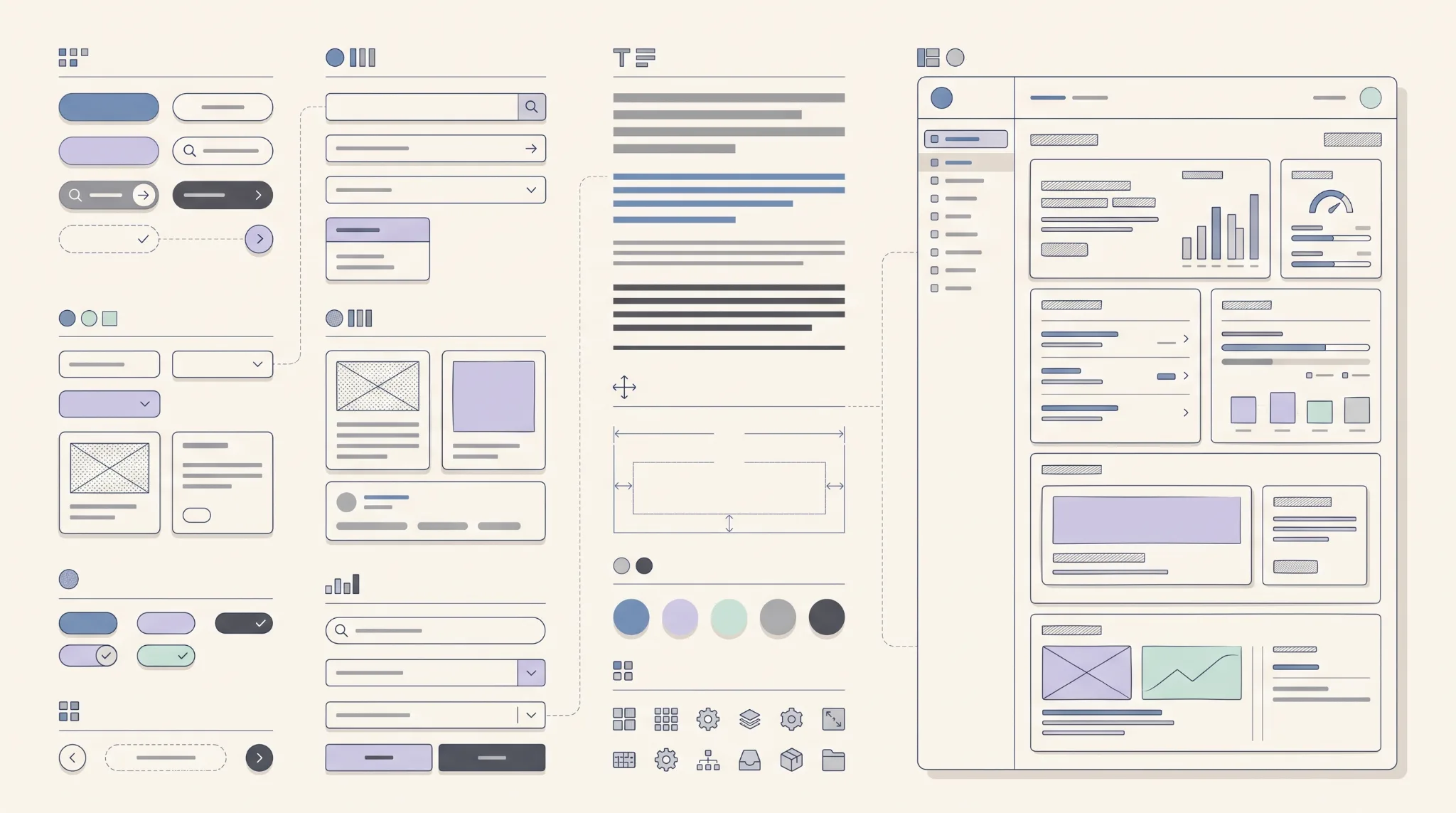
A better strategy is to divide implementation into manageable stages.
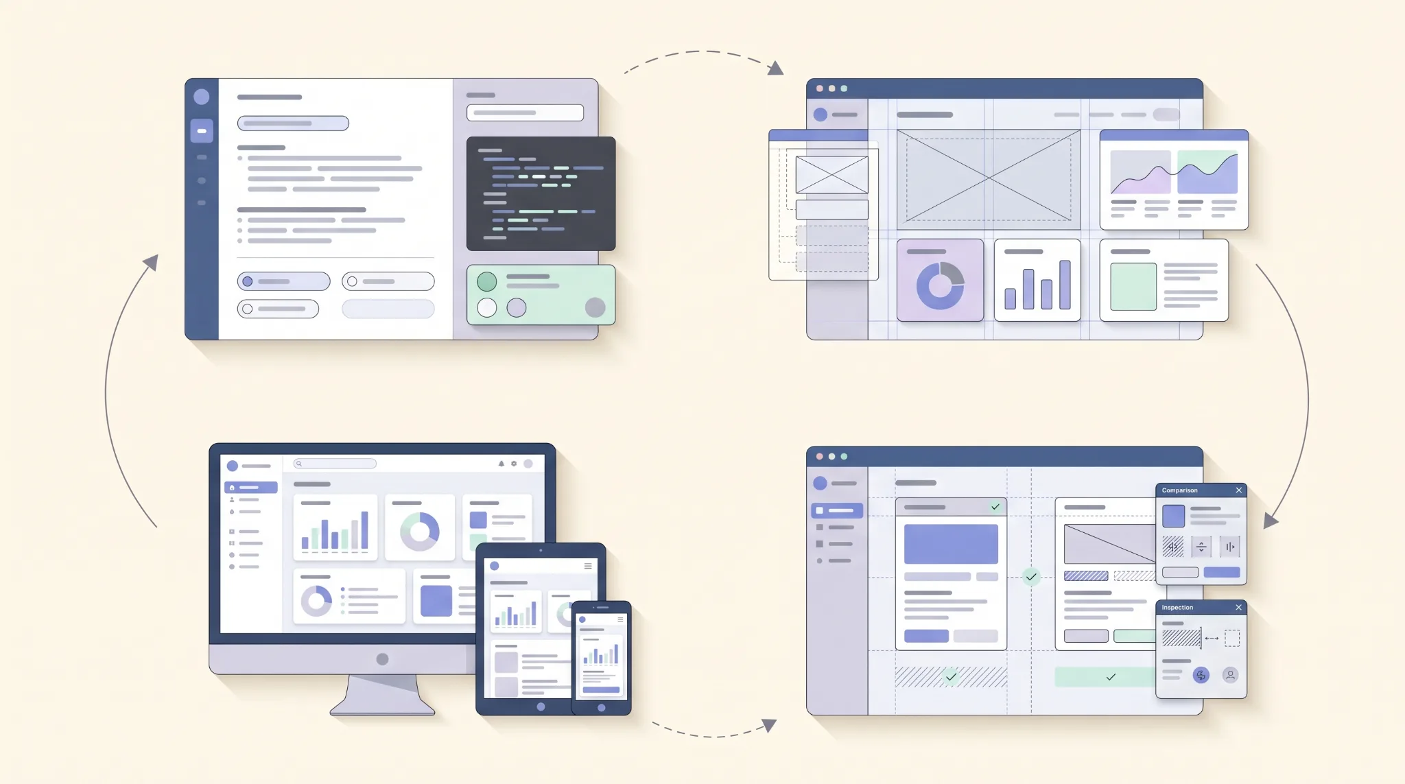
Stage 1: Application shell. Build the global layout, navigation, header, content container, and responsive structure.
Stage 2: Shared components. Implement the reusable UI components and establish their visual and behavioral rules.
Stage 3: Representative screen. Build one important page to validate the design system before applying it throughout the application.
Stage 4: Remaining screens. Implement additional pages using the established patterns.
Stage 5: Interaction and refinement. Connect controls, verify states, and improve visual consistency.
This sequence allows you to catch foundational problems before they spread across the application.
It also makes AI-generated code easier to review. Instead of asking the model to create twenty unrelated components at once, you can evaluate a smaller set of changes against clear requirements.
Keep backend endpoints, frontend behavior, and presentation logic appropriately separated. That makes it easier to change the visual design without accidentally disrupting application functionality.
For complex products, maintain a task checklist so the AI assistant can track completed work, outstanding requirements, and implementation constraints.
6. Improve Your UI Prompting Workflow#
Good UI prompts are specific, contextual, and testable.
Instead of relying on vague instructions such as "make the dashboard beautiful and modern," explain what the page must accomplish, which design rules it must follow, and how the result will be evaluated.
A useful prompt structure includes five elements:
- Context: Describe the product, audience, and purpose of the screen.
- Requirements: Specify the content, features, and user actions.
- Design constraints: Reference the design system, layout, typography, and visual direction.
- Technical constraints: Define the framework, existing components, and implementation boundaries.
- Acceptance criteria: Describe the observable conditions the completed interface must satisfy.
For example, a more effective prompt for a fleet management dashboard would be:
Build the fleet overview page for a web-based fleet management platform used by operations managers. Use the existing application shell and design tokens. Present fleet status, active vehicles, delayed deliveries, and recent operational alerts in a clear visual hierarchy. Provide quick access to vehicle details and delivery exceptions. Keep the layout responsive, reuse existing components, and include loading, empty, and error states. Do not introduce new colors or component styles without a clear requirement. Before finishing, verify the layout at desktop, tablet, and mobile widths and check that all visible controls have meaningful behavior.
This prompt establishes a clear objective without prescribing every implementation detail.
After the first output, avoid asking the AI to redesign everything because one section looks wrong. Give targeted feedback instead.
For example: "Reduce the vertical spacing between the summary cards, strengthen the hierarchy of the page title, and align the table toolbar with the content grid. Preserve the existing typography and color tokens."
Specific feedback makes iteration easier to evaluate and reduces the risk of introducing unrelated visual changes.
7. Make AI-Generated Interfaces Look More Professional#
Once the basic structure works, focus on the details that separate a usable interface from a polished product.
Fix visual hierarchy#
Users should understand what matters most without having to inspect every element. Establish clear relationships between page titles, section headings, supporting information, primary actions, and secondary details.
Avoid giving every card, heading, and badge equal visual emphasis.
Refine spacing and alignment#
Consistent spacing creates rhythm and helps users understand which elements belong together. Use a defined spacing scale and align content to shared grid boundaries.
Do not add whitespace randomly or compress everything to fit more content onto the screen.
Improve typography and contrast#
Choose readable font sizes, sensible line heights, and appropriate text contrast. Use font weight and size deliberately rather than making every label bold.
Long descriptions, tables, and metadata should remain readable at realistic screen sizes.
Use color with purpose#
Color should communicate hierarchy, interaction, and meaning. Reserve semantic colors for relevant states, such as success, warning, and error, and maintain sufficient contrast.
Decorative gradients and shadows can be useful, but they should not compensate for weak structure or unclear navigation.
Design meaningful states#
A professional interface must account for more than its ideal screenshot.
Consider loading, empty, error, success, disabled, and permission-restricted states where relevant. Explain what happened and, when possible, provide a useful next action.
Finally, replace generic placeholder content with realistic examples. Realistic names, dates, status labels, and data values expose layout problems that dummy text often hides.
8. Validate the UI Beyond the Screenshot#
A screenshot can make an interface look complete even when important parts of the experience do not work.
Visual validation should be combined with functional and usability checks.
Start by testing common user journeys. Can users navigate to the right screen, filter a table, submit a form, recover from an error, and understand the result of an action?
Then inspect responsive behavior. Check whether navigation adapts correctly, tables remain usable, content wraps naturally, and primary actions remain accessible on smaller screens.
Accessibility also needs deliberate attention. Verify keyboard navigation, visible focus indicators, semantic HTML, form labels, meaningful button names, and sufficient color contrast. Use automated accessibility tools as an aid, not as a substitute for reviewing the actual experience.
Capture screenshots at consistent viewport sizes and compare them with your intended design direction. Look for misalignment, inconsistent spacing, unexpected wrapping, overflow, and visual drift between pages.
When a problem appears, identify its source before changing the code. Is it caused by a design token, a shared component, a page-specific layout, or the underlying content?
Fixing the source is generally more reliable than applying another one-off styling adjustment.
9. Common UI Design Mistakes Vibe Coders Should Avoid#
Several habits can make AI-assisted interface development slower and less reliable over time.
Generating everything at once. Large prompts can produce a working prototype, but they are harder to validate and maintain. Break complex applications into smaller, testable tasks.
Mixing visual styles. Combining unrelated references without a coherent system often results in inconsistent typography, spacing, and component behavior.
Treating screenshots as complete specifications. Screenshots rarely explain responsive rules, accessibility, interaction states, or business logic. Document those requirements separately.
Ignoring existing components. Allowing AI to recreate similar components repeatedly introduces unnecessary duplication and design drift.
Polishing visuals before validating usability. A beautiful dashboard is not successful if users cannot find essential information or complete their tasks.
Accepting the first output. AI-generated code and UI still require review. Evaluate the result against product requirements, design rules, and actual user workflows.
These mistakes are avoidable when design decisions are made explicit and the implementation is reviewed in small increments.
10. A Repeatable UI Design Workflow for Vibe Coding#
You do not need an elaborate design process for every small project. What you need is a repeatable workflow that scales with the product's complexity.
Use the following sequence as a starting point:
- Define the product. Identify users, key tasks, core features, and the information each screen must present.
- Establish visual direction. Collect relevant references and document the intended visual personality, layout principles, and interaction patterns.
- Create design rules. Define design tokens, shared components, variants, states, and responsive behavior.
- Build the application shell. Implement navigation and the global layout before creating individual pages.
- Validate one representative screen. Check whether the design system works with realistic content and actual product requirements.
- Implement the remaining screens. Reuse established components and document exceptions when a page genuinely needs different treatment.
- Test and refine. Review functionality, responsive behavior, accessibility, and visual consistency.
- Document the result. Update project instructions, component documentation, and implementation notes so future AI sessions can continue without reinventing established decisions.
Keep the design brief, component rules, and outstanding tasks available to your coding assistant. This is particularly important when working across multiple sessions or switching between different AI models.
You can also create a simple review checklist for every page: Does it meet the product requirements? Does it follow the design system? Do its controls work? Are all important states covered? Does it remain usable on smaller screens?
This process turns UI generation into a controlled feedback loop rather than a sequence of unrelated prompts.
Conclusion: Treat AI as Your Implementation Partner, Not Your Design Strategy#
Vibe coding makes it easier to turn ideas into working software, but speed alone does not guarantee a good user experience.
The quality of an AI-generated interface depends heavily on the decisions that guide it: understanding the product, choosing a visual direction, defining reusable design rules, breaking work into manageable tasks, and evaluating the result against real requirements.
You do not have to design every component manually before writing code. You do, however, need to give your AI coding assistant a clear system to follow.
Start with a lightweight design brief. Establish your design tokens and shared components. Build one representative screen, test it, and refine the system before expanding across the application.
Most importantly, judge the interface by how well it helps users accomplish their goals, not just by how impressive it looks in a screenshot.
The best UI design strategy for vibe coders is not to prompt harder. It is to make better design decisions, give AI clearer constraints, and validate the output continuously.